Thursday, December 30, 2010

Sketch at Paneras


Daily Sketch - 5.5x8.5

I did this sketch of a young man at Panera's this morning. He was so intently at work on his laptop that he was easy to capture. He hardly moved at all.

His name is Steve Watkins. When I had completed the sketch, I went over and told him what I had done and showed him the picture. It was a delight to meet him.

Wednesday, December 29, 2010

Winter Road - WIP


Detail of Work In Progress...

The problem here is that I'm dealing with a lapse of time - several days. I've been away from "December Road" for a week, and the inspiration and concept have grown cold. There are two big problems I need to address:

  1. After the interruption, I see some problems in the areas I had done earlier, but I must avoid the temptation to go back and rework them. They were part of an earlier idea that I don't want to lose.
  2. I find myself wanting to pull new colors into the unworked areas in an effort to transition to new ideas to add interest. The difficulty is to keep continuity throughout. That continuity is difficult because I tend to lose the "inspiration" over the week I've been away.

Time to go slowly, or I will destroy the piece altogether.

I think that after blocking in some of the areas (as was suggested by Carly Hardy) so that the color was consistent, I found it easier to remain faithful to my vision. Also blocked in the road to establish the "cool" contrast to the warm fields. I had to keep reminding myself to stay away from sharp detail and concentrate on forms.

The frost and remains of snow were a touch I want to add, but I'm having a problem getting the shading and shadows right. Snow on the open ground lower left may be a problem.

Thursday, December 23, 2010

Dec. Road WIP 12-23


Things I learned today, or of which I was reminded:

  1. Add color not detail.
  2. Move from passage to passage, don't get bogged down.
    When I stay too long in one area, I tend to overwork the painting, and the result is mud!
  3. I need to put the piece of chalk down as soon as I finish the ONE thing I picked it up for.
    If I don't, that color works its way into too many places.

Wednesday, December 22, 2010

December Road WIP

This is my "end of the day" post of work accomplished today. Distractions abound, and I am too easily distracted.


Made corrections to the sky - added more blue, intensified the color, deepened the value. I don't know if it's a more believable December sky, but I think it's definitely more interesting.

Tuesday, December 21, 2010

Lifelike, Believable, Interesting


My first effort at a sky for the pastel I've started points out my current issue regarding three concepts related to painting and sections of paintings. These concepts are; lifelike/realistic, believable, and interesting.
  • Lifelike / realistic - for me, this is the effort to make the painting look like life by matching form, color, value, perspective, etc. The result is as close as I can get to photographic realism. The truth is that I lack the skill or patience to accomplish this.

  • Believable - where lifelike requires exact representations of the subject, it is also possible to represent the subject in a way that may not be exact but that is recognizable and avoids being so extreme as to be "unbelievable." The result is a "believable" painting.

  • Interesting - an interesting painting is one that captures and holds the attention of the viewer. Unfortunately a painting can be exactly realistic or modified yet believable, but the result is not interesting. The goal I strive for is to make my paintings interesting. I want to capture and hold the interest of the viewer.

The result of the sky in this painting is believable, but is truly uninteresting.

The hardest time of all

Finally got it started. I put this photo up as a trial to see if the winter sky I want will work with the design. The horizon is a mixture of light lavender and pale yellow that draws to blue as it moves upward. The lavender fades first, then the yellow. The status clouds are done in the palest of yellow with some white. I wanted to create some movement, but I want to sleep on it before I put in the trees and go beyond the point of no return.

Well, I have a drawing - now for some color....

The most difficult time for me is to address the blank paper or canvas. That's where I am today. Having failed miserably on my last attempt - yesterday was a waste - I now look at a new sheet of UArt cut to 21x15. I've marked it for a grid, I know what I want to paint, I have a vision of what I want it to look like, I even have a good drawing of the scene.... So, why is it so hard?

Sunday, December 19, 2010

Sunday before Christmas, 2010

Charles Le Brun - "Announcement to the Shepherds"
2 Timothy 2:8
Remembering that Jesus Christ, of the seed of David, was raised from the dead according to my gospel....

It's interesting, perhaps even curious, to me that I have come to this verse in my personal study a week before Christmas. As wonderful as Christmas is, the events in Bethlehem are only prelude to Passover in Jerusalem, and even the Crucifixion loses its significance without the Resurrection. So when Paul defines the energizing element of our faith and action it is the fact that Jesus Christ was raised from the dead. Merry Christmas!

(Notes from my personal study, dated December 18, 2010)

Friday, December 17, 2010

Sanded Paper Texture


Things I Leared Today
This post is an experiment - keeping notes on-line of things I learn or of which I need to remind myself.

Today - different textures of sanded paper respond differently to broad areas such as sky or backgrounds.

Smooth paper - UArt
  • Rembrandt harder pastels work well. Blending with fingers can wear out the fingers.
  • Sennelier works well for accents, last touches.

Textured paper - Arches self-sanded

  • Rembrandt does not blend well over broad expanses - the paper texture keeps it from being smooth or blending one color into anohter
  • Sennelier works better can be blended with the fingers

Thursday, December 16, 2010

Caravaggio - "The Adoration of the Shepherds"


In my estimation, Caravaggio captured personality and emotion in his work better than anyone. At this season, I wanted to remind myself that above all else, this event and the life that followed are the center of all life, time, and eternity.

Wednesday, December 15, 2010

Winter Road

Charcoal on paper - image size 10.5 x 7.5

This 30 minute value study for a larger work turned into a multi-day project. My inspiration was a return to a road that I had painted earlier. This particular stretch or road undulates over the hill and then makes a sharp left beyond the abandoned farm place at the top of the hill. The winter shadows were long and dramatic, but the light was still bright. There was some light snow in the bottoms, yet the colors in the fields were still warm and brilliant.

I still plan to do a larger work, so I've left the reference marks in the margins. I will eventually mat and frame this one!

This scene and this day were especially poignant for me because I had my father with me who is in ill health. One never knows when we will return to this place.

Tuesday, December 14, 2010

Winter Road - nearly complete

I still have some more touches to add to the road, shadows, and the right foreground. The last step will be to deepen some of the values and bring out highlights. I should be finished tomorrow morning.

I left the registry marks on the outside edges so that I can mark it up for a larger work if I need to without going back into the drawing. Charcoal tends to be a little messy for that.

Monday, December 13, 2010

Winter Road - 12-13-2010


Work-in-progress

This drawing started out as a value sketch for a larger work in pastels - I expected 14x10. As I began working in charcoal, I soon decided that the finished work should be more than just a sketch. I have been working upper-left to lower-right to keep my hands from smearing the charcoal unexpectedly.

There's more work to do, but I wanted to take a picture to mark my progress and get it up for comments.

Friday, December 10, 2010

Winter Road


This is the photograph that I'm using for the initial drawing and design for a new painting. I have selected the size of my first effort on this to be 14x10 on self-sanded Arches cold press paper. I like the texture that the paper transmits to the final work giving it a sparkle and life that I've not been able to achieve on UArt paper.

While I was in Iowa with my ailing father, I did not have time to do any sketching or painting. I did take a few photos. This is the winter view of the same stretch of road that I used in my previous work "Spring Road."

Thursday, November 25, 2010

Spring Road

Pastel on UArt - 27x21

This is a view of a road east of Harlan, Iowa, looking to the west. I made some sketches of this scene and took reference photos in the spring of 2009. I have finally gotten around to painting it.

My first attraction was to the trees on the left, but as I worked on the design, I found much more interest in the road as it disappeared over the hill. The trees were just beginning to show the first flush of true, fresh green. The clouds were broken, and the south wind was whipping them away.
Photo taken of signed and completed work on 11/26/2010 under natural light without modification.

Thursday, November 18, 2010

Spring Road


11-21-2010 Last update.... Progress is slow. Some days are better than others. Will be off for a day or two before I can finish this.


11-21-2010 Update - cropped subject to examine my work. I did the trees with Sennelier which is softer than Rembrandt and gives softer, less precise lines. Colors in this image are not exact, but I'm looking at the quality of the process.


12-19-2010 pm
I have "completed" the sky. My object was to make it attractive and believable without making it a focal point. I've laid in the the basic color objects with out definition. It is time now to evaluate the relative values and color relationships. The actual colors are warmer than this photo shows.

11-19-2010 am
Line drawing on UArt - grid mostly erased - line drawing to define major shapes, color masses. I sprayed this graphite drawing with fixative so that it won't bleed through onto the image.


A grid drawing on a work this size is necessary for me, especially when I'm not working with the view before me. With my MS, I seem to have lost the ability to improvise. I've discovered that I have to work out details, eliminate and add features, move items, decide on focus, values, and movement with care because I can't do those things in the fly anymore.


Started larger work on UArt 27x21 using reference drawing and photos from the spring of 2009.

Friday, November 12, 2010

Royal Morning


Pastel on UArt, 27x21


I have finished and signed this painting this afternoon. It has been longer in the works because of interruptions and distractions, but that's life.


I have tried to capture the purples and lavenders of morning on the Intercoastal Waterway looking southwest from the Little Jetties toward the Wonderwood Expressway Bridge which is two to three miles away. The passing clouds cast the foreground in shadow but bathe the near shore and the far bank in bright light.

Thursday, November 11, 2010

Royal Morning


Pastel - UArt 27x21

Work In Progress

I'm putting this up for my own evaluation. I have added the palm tree as a design element, but I'm not satisfied with the value/color. I'm still new to pastels, and would like to mix my own greens for this. Alas, mixing is a problem.

Monday, November 8, 2010

Royal Morning

11-10 Work for today
11-09 Work for today

Second Look


First Iteration...

Pastel on UArt 27x21

Work in Progress

This picture is based on sketches and reference photos looking from the Helen Floyd Park across the ICW toward the Wonderwood Expressway bridge. I especially wanted to capture the purple and lavenders in the sky set against the sunlight on the sand across the water. The foreground was in shadow which should make the picture more dramatic.

Monday, November 1, 2010

Falling Tide, October


Pastel on UArt 27x21

To purchase, contact me.

The concept behind this painting is the color and openness of the salt marsh at mid morning. The wind is just coming up and ruffling most of the reflections. The tide is falling exposing more and more of the shore line. Across the marsh are some houses that stand out in the morning brightness, but they seem lonely and almost lost in the expanse of grass and water.

This is a view of the landing at Castaway Park. I developed this from a plein air painting and reference photos.

Tuesday, October 26, 2010

Low Tide, October

Updated 10-28-2010

Update for 10-27-10


Pastel - UArt 27x21
Work In Progress

Update for 10-28 - (had to repaint a wall in the living room) worked on point of land to the left, reflections and water.
Update for 10-27 - more painting of the house, but I did get in a little time on this pastel. worked on water lines and shore on the left.
I'm putting this up to show that I am working. This view of the salt marsh from Castaway Park is an expansion of the plein air small work done on the 16th. I am trying to capture the light and color of and October morning.

The red is and under coat for the greens of the marsh grasses. I have put down the carmine and sanguine mix and sprayed it with fixative in order to establish the contrast and to see the form of the design.

Stay tuned....

Saturday, October 16, 2010

Low Tide

Pastel on UArt 12x9

Not for sale

The First Coast Plein Air Painters had a paint-out today at Castaway Island Park. Several of us showed up to enjoy the perfect weather and the beautiful views of the salt marsh and estuaries. I did this painting on UArt 800 with Rembrandt pastels. The sanded paper holds the pastel but makes broad blending difficult. I'm still learning to use smaller amounts of different colors juxtaposed in order to accomplish visual blending of color.

As I was finishing up and getting ready to add the reflections in the water, the wind came up. It's not easy to paint on paper that is flapping in the breeze, so I come home and will "finish up" later.

Wednesday, October 13, 2010

The Beachcombers


Pastel on UArt - 12x9

To purchase, contact me

This is a representation of a scene I observed last week at the beach that held a sense of drama and contrast. The waves were rough especially near shore, but at low tide, they had left the beach wide and flat. A young man was combing the beach with a metal detector while a small flock of sandpipers worked the sand near him. They were all beachcombers - one with high tech for what someone else has lost and the birds for food that God provides. There must be a moral here, but that's not my point.

This painting is my first effort on UArt paper. I wanted to experiment with smooth sanded surfaces. The work was done freely and quickly without concentrating on specific details. I used Rembrandt pastels because they seemed to respond better to the sanded texture.
I replaced the photo of the painting this morning - October 14 - after making a few adjustments to the main figure.

Tuesday, October 12, 2010

Beachcombers


Pastel on UArt 12x9
Work in Progress

After 2 weeks of painting our master bedroom and bath (don't ask), I've started a new work on UArt paper. I went to the beach last week and was intrigued by the juxtaposition of a young man with his metal detector and a small flock of sandpipers. Both were combing the beach - one with technology for recreation, and the birds for daily food.
I liked the design. The tide was way out, but the sand was wet over a broad expanse.

Saturday, September 25, 2010

Heading Out


Pastel on Self-sanded Arches 14x10

Update 9/30/2010 - I do not like the water among other things, and I am redoing it. Wait for further developments.

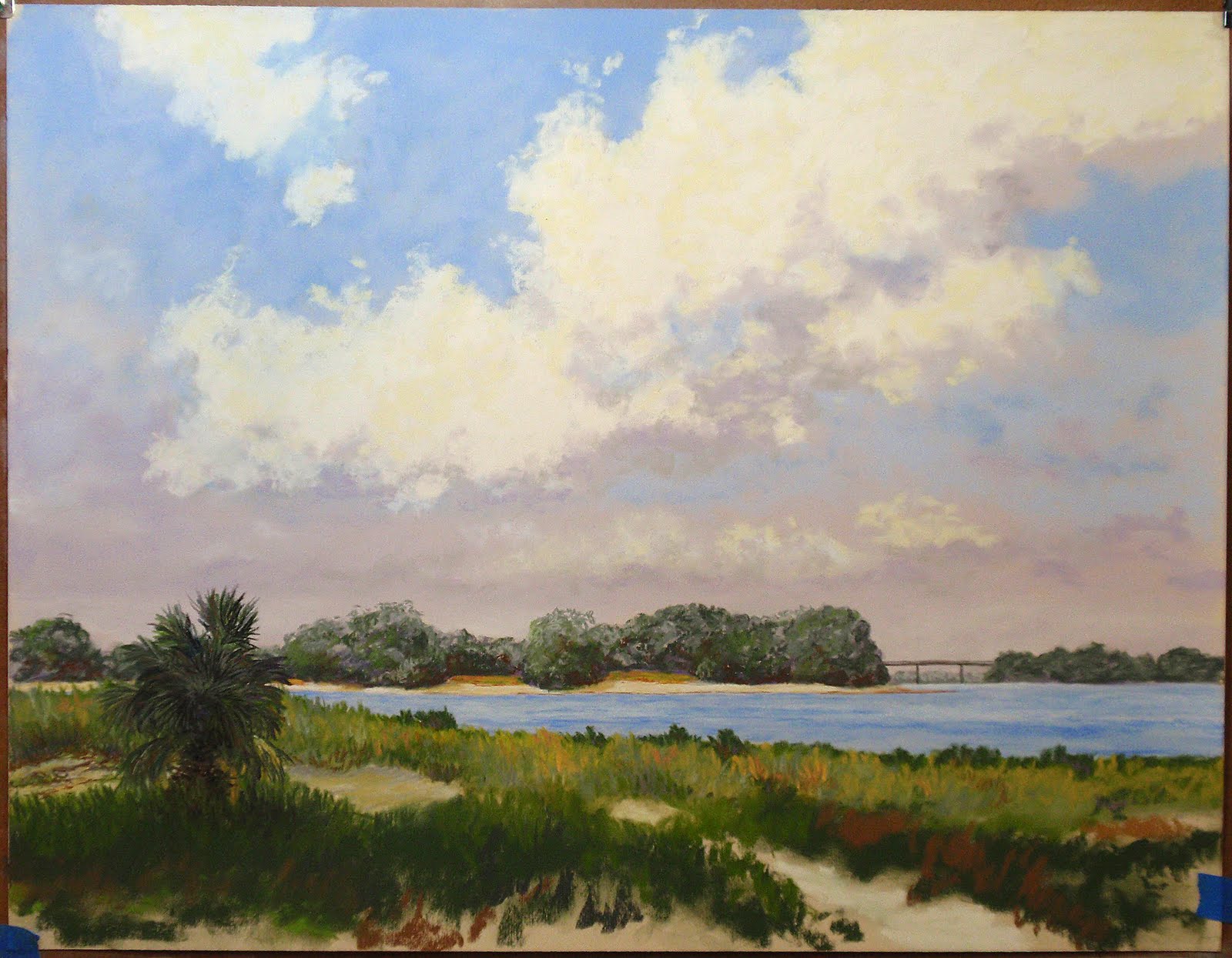
This is a view from the Little Jetties, Helen Floyd Park, looking across the San Pablo River / Intercoastal Waterway. This is where the ICW meets the St. Johns River. The channel has cut into the bank on the far side making a dramatic backdrop for the boats as the make their way into the open water. The sea breeze has caught the sail of the nearest boat as he heads out for the day.
This view impressed me with it's dramatic view of the eroded bank, the blue of the water, and the almost overpowering brightness of the sunlight. By mid morning, the sun has burned away the haze, the sea breeze has come up, and a few puffy clouds dot the sky.

This photo (9/25/2010) shows the painting unsigned. I am still deciding whether or not to call it finished.

rjp

Monday, September 20, 2010

"Heading Out" - Little Jetties WIP

I'm putting up another iteration - changed the boat and it's placement. I like it better, but it still has some issues I don't like.
I spent most of the day painting the bathroom. This is not art - it's egshell laytex.

Friday, September 17, 2010

Palisades ICW - Work in Progress


I'm putting this up for review. It's still a work in progress. I had hoped to complete this in one day, but I got interrupted. Still a lot of work to do on the foreground, and some issues to resolve.

Since I had to pause, I'm considering what to do with the little boat. Should it be larger or not there at all? It's some kind of small tug with a pusher bar on the bow and an outboard for power.

Wednesday, September 15, 2010

En Plein Air Outing


I took my pastels to the Little Jetties - to work on the view across the Intercoastal Waterway. This was my first outing with pastels in more than two years. There were some things with which I am pleased, and much that I need to learn.
Here are some pictures for reference.
rjp

Thursday, September 9, 2010

Red Flag Day


Pastel on self-sanded Arches - 14x10

To purchase, contact me.

After a bout with a bad cold, I'm back at my easel. Finished this painting today. Earlier this summer I took Patty's dad for an outing to visit some of the places we used to go to fish, and I took along my camera. This view of Cape San Blas was done from sketches and photographs of the beach. It was very windy, and the red flag was up.

rjp

Thursday, September 2, 2010

Red Flag Day


Work in progress....

Update posted 9/3 - shows some progress...

This is the plan and beginning of another beach scene - dunes. The sketch and photograph are from Cape San Blas on a day when the red flag was up, but as you can see, there are still people in the surf. Well, maybe you can't see them from this photo, but they will be there in the final picture.

I've been away from my easel for a few days to take care of some things for Patty's parents in Panama City. It's good to get back.


Friday, August 27, 2010

Dunes at St. Andrews State Park


Pastel on self-sanded Arches - 14x10

To purchase, contact me.

After making a few very minor touches, I signed this piece and sprayed it with fixative. That is my way of saying "Il est fini!"

I am pleased with the way this worked, and if you read the previous posts, you can see it how the work progressed.

These dunes and the sugar-white sand of St. Andrews State Park with the jetties in the distance have been a continuing inspiration to me since I first saw them in 1967. I have drawn and painted them often before, but not with this kind of success!

rjp

Thursday, August 26, 2010

Dunes at St Andrews SP WIP C


Pastel on Sanded Arches - 14x10

I have "completed" the basic picture, but I'm going to let it stand for a few hours before I put my name on it and call it "fini!"

This has been a good learning experience for me, a refresher course in soft pastels. Best of all, I am pleased with the result.

Tuesday, August 24, 2010

Dunes at St Andrews SP WIP B


As you can see, I have made some progress, but there is still a fair amount of work to do. I had hoped to finish this painting today, but there were a number of interruptions. I hope to finish tomorrow, but that may not be possible. I will need to attend the funeral of a friend, Jerry Davis.

Monday, August 23, 2010

Dunes at St. Andrews SP WIP


I am putting this up to show that I am working. This pastel 14x10 on self-sanded Arches paper is beginning to take shape nicely.

Thursday, August 19, 2010

Remember that Morning


Oil on canvas - 24x18

To purchase this painting, click here.

This is my second expression in oil of this view of the palm thickets and dunes at Cape San Blas, Florida. I have tried to capture the stillness and bright sunshine of mid morning. The view is looking from the boardwalk across the dunes to the Gulf.
The beach and dunes always interest me and present a particular challenge for painting. The foreground is defined in bright color and deep value contrasts while the distance is muted and soft with little variation in value. The bright sunlight, however, limits the amount of blue that works for creating distance in the painting.

My son my, father-in-law, and I have been here often to fish in the gulf, so this place has a special memories for me.

Rick Petersen

Path in the Pines

Pastel 12x16 on LuxArchival 100 This view of an old path through the pine woods has held my attention for years.  The woods are now a housin...