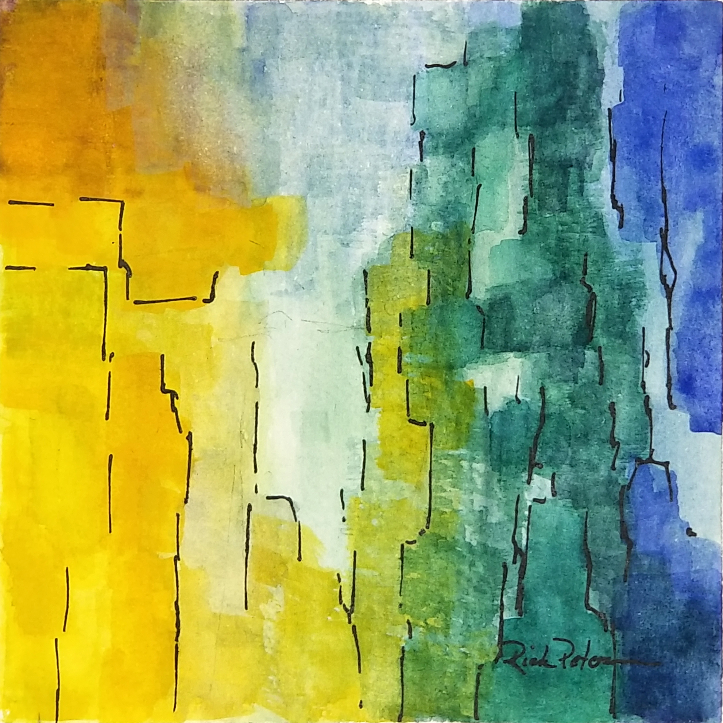
Monday, December 19, 2022

Cardinal in Snow

Cardinal in Snow


 Line and Wash on paper

This winter scene of a cardinal on the branch of small tree with snow is the setting for a Christmas card.  The light in the snow and the reflections on the dark branch give a sense of peacefulness and color.

Thursday, December 15, 2022

White Tie and Tails

White Tie and Tails

 Pastel 9x12 

This seagull is all dressed up and waiting for dinner.  This is a rework of an earlier painting - I changed the tide line wave and the wet sand so that they added to the composition without distracting from the subject - the patient seagull.

Thursday, December 8, 2022

Christmas Tree 1

Christmas Tree 1

Watercolor on Canson Paper - 5x7

This wet-in-wet watercolor fir tree in the snow is the foundation for my digital download Christmas Cards.
 

Wednesday, November 16, 2022

Flight

Acrylic 9x6 on Montval Paper

My initial goal was to present a workable and engaging composition of small, light colored "boxes" against a nondescript background.  I started with gray and blue gray, but found it too lifeless.  This deeper blue back gound works to bring the focus forward to the yellow rectangle in the upper left.  The rest of the elements are placed and colored to draw the eye to that point and then to move it throughout the painting.
 

Saturday, September 24, 2022

Fountains and Light

Fountains and Light

Acrylic on Paper, 6x6 Inches

My goal for this abstract was to create a blue, formless background upon which to paint structures that would carry the interest.  I added areas of white and very light green blue and lavender to indicate upwelling fountains of water in the darkness.  I put them into the painting in such a way as to draw the viewer into the painting and move his attention from place to place.
 

Friday, September 16, 2022

Come on In


Come on In

Watercolor, Ink, and Pastel - 12x8 on Paper

This is a view of a garden door from Avilez Street, St. Augustine, Florida.  Coming from the heat of the Florida sun into the cool shade and color of the walled garden is an irresistible invitation.  This painting was done on request for a good friend.

Thursday, September 15, 2022

Emerging (Abstract 19)

Abstract 19

Acrylic 4x4 on paper

My objective on this painting was to build my composition upon a focal area in the upper left.  I started with areas of orange and blue which seemed to clash, and the blue won out along with help from lavender and red with white.  In the end, though, a yellow influence remained.

Friday, September 9, 2022

Boundaries

Boundaries

Gouache and Ink, 4x4 on paper

My goal for this painting was to use the warmer side of the color wheel with blue through yellow only.  This required that the blue and yellow would not be used where they could blend to green.  I wanted the main focal area to be a light area on the lower left with secondary areas in the upper left and upper right.  I added the lines to set "boundaries" between close colors and values and to provide suggestions of movement.
 

Thursday, September 8, 2022

Structures 4

Structures 4

Gouache and Ink, 4x4 on Archival Paper

My goal in this painting was to create a point of interest in the upper left with bright yellow and to have that area supported by shades of yellow, green, and blue. I added the lines for definition and to create movement.

Saturday, September 3, 2022

Quiet Patterns

Quiet Patterns
Acrylic on Archival Paper - 4x4

This painting developed into the idea of the focal area on the lower left with repeating colors and values leading to the lower right and then to the upper right.  With my decision to keep the composition quiet, I chose a palette that eliminated all the red and lavender pigments so the all I am using is azo yellow, Prussian blue, and phthalo green with white.
 

Thursday, September 1, 2022

Praise in the Dunes

Praise in the Dunes

Ink and Wash, 5x7 on Paper

The wind constantly moves and changes the dunes, and as it does, it carves dynamic breaks and banks in the sand as the sea oats and shrubbery holds back the top of the dune.

Sunday, August 28, 2022

Structures 3

Structures 3

Gouache and Ink, 4x4 on Paper

My goal on this small abstract was to create a pseudo horizon with a white focal point in somewhat the center.  I wanted the objects, colors, and lines to create movement. 

Wednesday, August 24, 2022

Peace at Mid-Day

Peace at Mid-Day

Pastel on self-sanded board: 11x15

At midday in the heat of summer, the morning breeze dies away before the sea breeze picks up, and a sense of peace and stillness settles over the salt marsh.  Even the ceaseless tide seems to stop.  The clouds begin to gather, and the sun is partially hidden as a hazy light invades the deep shadows under the trees.  A softness settles on the grasses turning their greens into gold and yellow as a hint of the autumn soon to come.

This is a rework of an old painting.  I touched it up to give it new life.

Cattails with Hope

Cattails with Hope Rm 15:13
Ink and Wash, 5x7 

These cattails on the edge of the pond present such an image of peace and calm, that I was inspired to  paint them.  I adjusted the composition to remove the horizon and the sky for the simplicity of the scene.
 

Sunday, August 21, 2022

Dunes with Delight

Dunes with Delight, Psalm 1:2

 Watercolor Line and Wash, 4x6

The steep curve of the dunes held in place by the sea oats with the sea gulls overhead is a setting that reminds me to delight in the Lord who cares for me.

Thursday, August 18, 2022

Object

Object

Gouache and Ink, 4x4 on paper

The idea I wanted to explore in this small work was the presence in a completely nonrepresentational painting of one, clearly defined object.  Naturally the object would be the center of interest, but I wanted the other features of value, color, and line to create movement and interest within this context.

Sunday, August 14, 2022

Watch Tower St Augustine

Watch Tower St Augustine
Ink and Watercolor, 7x5 on Paper

This is a view of the tall watch tower on the East wall of Castillo San Marcos in St. Augustine.  I am intrigued by the weeds on the roof, and the watchtower is often a roost for crows and pigeons. 
 

Friday, August 12, 2022

Cascade 1

Cascade 1


Gouache and Ink on Paper 6x6

My goal in executing this abstract was to create the sense of colors cascading from the upper left to the lower right on the painting.  I wanted yellow to be the dominant color with accents of blue, green and red to give motion and contrast to the painting.  I used white as the accent to brighten the focal areas and to move the viewer through the painting.
 

Tuesday, August 2, 2022

Structures 2

Structures 2

Gouache and Ink on paper, 4x4

The concept I wanted to explore in this painting was the evolution of color, form, and line beginning with yellow in the upper left and quinacridone rose in the upper right.   I wanted an area in the upper right quadrant to be the focal point and sketched in a few lines to guide the forms.  As I added prussian blue and white to the mix and extended the red/lavender, these forms and transitions evolved.

Friday, July 29, 2022

Contrasts 1


Contrasts 1
Acrylic on Paper, 6x6

The motivation of this abstract painting was to explore the use of underlying texture with contrasts in hue, value, intensity, temperature, and line.  I am also tying an unusual focal area at the center top at the edge of the painting which intentionally breaks several rules of composition.  I wanted to see if it would work - I think it does and creates a little tension as well.
 

Tuesday, July 26, 2022

Incoming Swell

Incoming Swell

Pastel, 9x12 on UArt Sanded Paper

This painting was "completed" some time ago, but it needed a bold rework. I changed the upper 1/3, added a wave, removed the horizon, and drastically changed the colors in the waves.

Monday, July 25, 2022

Structures 1

Structures 1

Gouache and Ink, 4x4, on Paper

In this painting, I wanted to work with the transitions between yellow through green to blue and do it in a way that looked like a progressing between structures.  I wanted the vertical shapes with to suggest something solid but organic in form.

Thursday, July 21, 2022

Patterns 6

Patterns 6

Gouache and Ink, 4x4 on Paper

My goal in this painting was to experiment with blue and yellow as they combine to make green.  I wanted to show a pattern of blocky shapes rising from the lower left and becoming more clearly defined and edged as it rose to the upper right.

Wednesday, July 20, 2022

Unsettled Weather

Unsettled Weather

Pastel 6x9 on Sanded Paper

When the weather changes, the beach takes on its own special wild beauty. As the sun begins to set and the wind picks up, a solitary couple has the beach and the weather to themselves. 

Structures 1

Structures 1 Acrylic

Acrylic on Paper, 4x4

My goal in this small "daily" painting was to experiment with Lucas Pasto acrylic to create texture.  On top of the texture, I added standard acrylic for color.  As the painting developed, colors seemed to fold one into another giving the painting "structure."  I added the lines to separate and add distinction to the color areas.  The idea was to draw the eye to the upper right where it could rest in the dark red and then to the left to circle the painting. 

Saturday, July 16, 2022

Experiments 1

Experiments 1


Acrylic 4x4 on Paper

Something entirely new for me - experimenting with Lucas Pasto heavy acrylics to add "dimension" to the flat surface. Set the design and colors with Lucas and went back with standard acrylics to refine the composition and colors.

Monday, July 11, 2022

Acrylic Patterns 1

Acrylic Patterns 1

Acrylic on paper, 4x4

My focal area was to be the two rectangles in the lower left - one is blue the other a light blue violet.  From that I wanted the four quadrants to radiate out with the blue on the left, green on the right.  I used the acrylic because it dies quickly and can work to overpaint in areas and to deepen the saturation.
 

Sunday, July 10, 2022

Patterns and Lines 2

Patterns and Lines 22 07 10
Gouache and Ink, 4x4 on Paper

This small abstract was built from the blue area on yellow which I wanted to be the focal area of the painting.  The primary colors grew from the yellow and shapes grew somewhat organically from the blue.
 

Saturday, July 9, 2022

Patterns and Lines 1

Patterns and Lines 8 9 2022

Gouache and Ink, 4x5 on Paper

My goal in this study was to create balance, variety, proportion and movement with a set palette of primaries around the focal area in the lower right quadrant.  The challenge was to balance the large yellow of the upper left with colors and shapes.  I used the lines to tie the composition together and to give the colors form and structure.
 

Tuesday, July 5, 2022

Patterns 5

Patterns 22 07 05

Gouache 4x4 on Paper

I did this small abstract with a goal of expressing a sense of calm and a feeling of contentment, but I also wanted to create a composition that held a strong focus and encouraged movement and a little tension.  I limited my palette to yellow, blue, and purple, with a touch of phthalo green and white.  I would like the viewers to create their own story in this painting.

Monday, July 4, 2022

Patterns 4

Curtain Patterns

Gouache and Ink on Paper, 4x4

My objective in this painting was to build around a focal area in the lower right with two bright pure colors - blue and yellow. I wanted then to build the composition from that with other primaries and combinations.  Stroke by stroke the curtain of color evolved, and I added some ink lines to draw the composition together.

Monday, June 27, 2022

Patterns 4

Patterns - 6/27/22

Gouache and  Ink, 4x4 on paper

In this study, I experimented with using areas of contrast in color and value to create a pleasing composition that brought the attention and interest to my focal area.  The format is small enough that I could experiment, and after a number of iterations, I found that amorphous forms with lines worked to create interest and bring focus.

Thursday, June 23, 2022

Patterns 3

Patterns 06 23 2022

 Gouache, 4x4 on Paper

My initial goal for this painting was to have a focal area in the lower left that as either light lavender or light green with purple and green on the sides coming together at the bottom.  I worked on this idea, and though I liked the color, the result was not quite right.  My wife suggested I turn it upside down, and it came together.  Sometimes it's the simple things that help.

Tuesday, June 21, 2022

Abstract 1 - Blue Coming Out

Abstract 1 - Blue Coming Out

Acrylic on Canvas, 11x14

This painting is completely abstract.  I started with the blue rectangle with blue in one corner and yellow in another and worked from there.  I limited my palette to the primaries plus white.

Monday, June 20, 2022

Lighthouse Inlet

Lighthouse Inlet

 Watercolor, Pastel, and Ink - 4x6 on Paper

This is the view of the St. Augustine Lighthouse across the inlet from Vilano Beach.  In the early morning, the low light streams across the live oaks and casts the lighthouse with bright white against the colors of the dark green.  As the day beings, a flight of seagulls sets out for breakfast.

Sunday, June 19, 2022

Patterns 2

Pattern 22 06 19

Gouache, 4x4 on Paper

My goal in this small abstract was to use basically "soft" colors and mostly soft lines with no ink line support. I wanted to see if the "no lines" abstract would stand on its own.

Tuesday, June 14, 2022

Pastel Abstract #1

Pastel Abstract #1

Pastel 9x9 on LuxArchival sanded paper

After a month of doing small abstracts in gouache and ink, I felt ready to move up in size and into pastel.  Pastel handles a little differently from gouache, so I had to accommodate some of those differences in order to get the result I was looking for.  Design and composition principles still apply.  What I wanted to achieve in this painting was a nearly equal division between two opposite colors - yellow and purple or blue and and orange while keeping the composition interesting and lively.  I wanted the area of interest to be in the lower left and to let the evolution of color and value determine what that interest would be.  Even more apparent to me in pastel is that every stroke determines the next within the context of achieving my goal.
 

Monday, June 13, 2022

Abstract #21

Abstract #21

Gouache and Ink, 4x4 on Paper

This is number 21 in a series of 20 because number 19 was a disaster.

My goal in this painting was to create interest and movement with warm colors and contrasting shapes and values.  I chose blue to purple for the upper left and light yellow in the lower right blending into warmer orange and red moving upward and to the left.  I had to add the touch of green to keep things honest.

Saturday, June 11, 2022

Abstract #20

Abstract #20

Gouache and Ink, 4x4 on Paper

This is number 20 in a series of 20 small abstract paintings.  My goal in this painting was to dominate the composition with lighter, cooler colors and values.  My initial intention was to use the mauve form in the lower left as the focal point, but I darkened it's value in order to make the light yellow green of the center of the composition the primary focal area.

Tuesday, June 7, 2022

Abstract #18

Abstract #18

Gouache and Ink, 4x4 on Paper

Number 18 in a series of 20 - My goal when I started this painting was to use light and pure colors of yellow, green, and turquoise in broad, unblended organic shapes.  I deliberately avoided straight lines and edges in the borders between colors and in the ink lines.  I had planned to use more opaque gouache with white to build up the colors and make contrasts and values more intense, but the original transparent wash was so soft and delicate that I chose to stop here.

Abstract #17

Abstract #17

Gouache and Ink, 4x4 on Paper

When I started this series of abstract paintings in gouache, I had initially thrown my first painting aside.  After taking another look I added some pen-work to the painting, and it came alive.  So I had to renumber my series, and in doing so, I realized that the original #3, this painting, needed the same kind of revision.  That allowed me to renumber the "old #3" as the "new #17."

The original concept here was to use blue and its complement orange to create composition around the colors yellow, red, and purple. The later addition of more lines and separation keeps the composition from becoming lost in its own complexity.

Abstract #1

Abstract #1

Gouache and Ink, 4x4 on paper

This is the first painting I had done as a purely abstract painting.  It was inspired by the work of Japanese artist, Hiroshi Matsumoto - check his Facebook page.  

I was not really pleased with the result, but I liked it enough to continue.  After doing 16 other paintings in the series of 20, I took another look at this original piece.  The basic color was good, but it lacked definition and separation, so I added ink lines which made a huge difference!

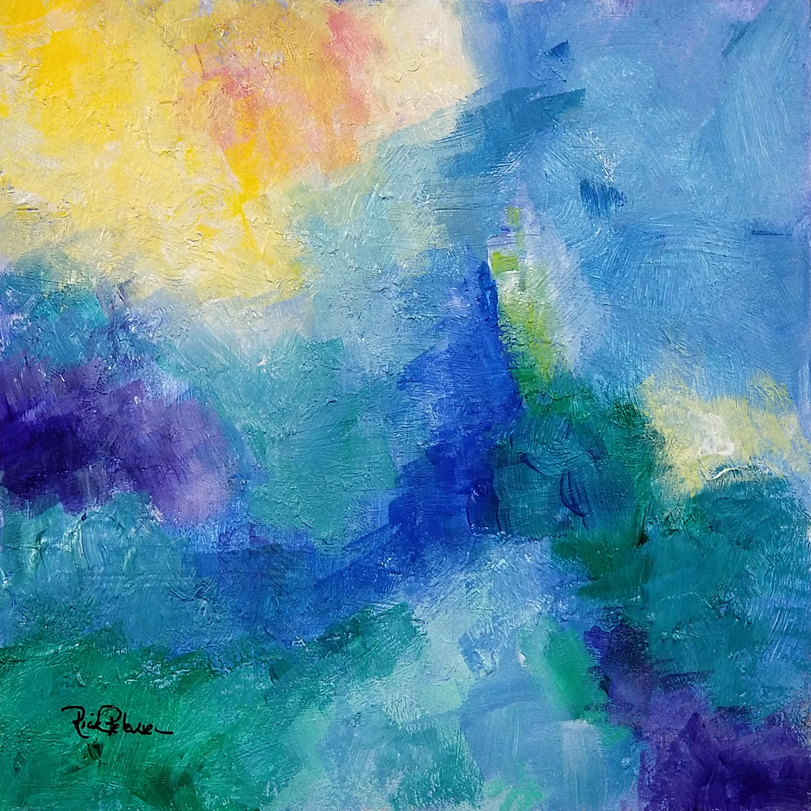
I had initially set my goal to use primary colors in gouache, and I continued with that standard through the rest of the paintings.

Monday, June 6, 2022

Abstract #16

Abstract #16
Gouache and Ink, 4x4 on Paper

This is number 16 of 20 in this series or exercises in abstract painting.  My goal was to use the warm corner of the color wheel for my primaries in this painting - red, cadmium yellow, a little quinacridone violet, and an old favorite, burnt sienna (which is not a primary, but....).  I worked with smooth textures on the top and broken textures on the bottom.  I placed the focal area in the center of the composition to see if it would work in a square format - I think it does.
 

Sunday, June 5, 2022

Abstract #15

Abstract #15

 Gouache and Ink, 4x4 on Paper

This is number 15 in the series of small, 4x4 abstract paintings.  For this painting, my goal was to use just ultramarine blue, lemon yellow, and cadmium yellow and let the green develop from that combination.  I started with blue in the upper left corner and yellow in the lower right.  I set 3 white areas on the "horizon line" for architectural structure and let the painting grow organically.

Saturday, June 4, 2022

Abstract #14

Abstract #14
Ink and Gouache, 4x4 on Paper

This is number 14 in my series with a goal of 20 abstract paintings using gouache and ink line.  I set a challenge on this painting to use just 2 main colors, blue and yellow with their near complements purple and green. My goal was to create a composition that demonstrated the contrasts between value, color intensity, and hue to show which contrasts captured and held they eye best.  In my opinion, value wins hands, down.
 

Thursday, June 2, 2022

Abstract 13

Abstract #13

Ink and Gouache, 4x4 on paper

This is number 13 in the series of 4x4 abstract paintings using primarily primaries.  My goal on this painting was to use only organic areas and ink lines to create interesting forms with mainly yellow and its interaction with the other primaries and secondaries.
 

Abstract #12

Abstract #12

 Gouache and Ink, 4x4 on paper

For this painting - number 12 in the series - I set my goal to use primary colors to create contrast in form, value, color, line, and placement. My goal was for the white rectangle on a stable "plinth" to be the balance for the organic nature of the rest of the composition.

Sunday, May 29, 2022

Abstract Primaries #11

Abstract #11

 Gouache and Ink, 4x4 on Paper

This is the 11th in my series of small abstract paintings using mostly gouache and ink and using a limited palette of mostly primary colors and white.  My objective for this painting was to avoid straight lines and predictable format.  I wanted this painting to hold two fratues - pleasing colors and a sense of surprise.  I wanted the pink dot to be the center of focus by the shapes and lines as well as by its color.

Friday, May 27, 2022

Abstract Primaries #10

Abstract Primaries #10

Gouache and ink on paper 4x4

This painting is the 10th in a series of abstract paintings using only primary colors and ink.  My goal for this painting was to emphasize the vertical essence with the color while minimizing the geometric accents and ink lines.  I was hoping the starkness of the forms against the "organic" background would create interest.

Wednesday, May 25, 2022

Abstract #9

Abstract Primaries #9

Gouache and Ink, 4x4 on archival paper

I set for myself the challenge to create a workable composition with fewer clear shapes, fewer lines and just two complementary colors.  I did add some purple to warm up the lower left corner and to add some accents in the vortical lines - other than that, the colors are all blue and yellow (which blends to green) with white.

Dune Passage in Summer

Watercolor and Ink on paper, 5x7 This is a variation of an old passage through the dunes.  In the midday summer sun, the light is bright but...