Monday, June 27, 2022

Patterns 4

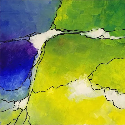
Patterns - 6/27/22

Gouache and  Ink, 4x4 on paper

In this study, I experimented with using areas of contrast in color and value to create a pleasing composition that brought the attention and interest to my focal area.  The format is small enough that I could experiment, and after a number of iterations, I found that amorphous forms with lines worked to create interest and bring focus.

Thursday, June 23, 2022

Patterns 3

Patterns 06 23 2022

 Gouache, 4x4 on Paper

My initial goal for this painting was to have a focal area in the lower left that as either light lavender or light green with purple and green on the sides coming together at the bottom.  I worked on this idea, and though I liked the color, the result was not quite right.  My wife suggested I turn it upside down, and it came together.  Sometimes it's the simple things that help.

Tuesday, June 21, 2022

Abstract 1 - Blue Coming Out

Abstract 1 - Blue Coming Out

Acrylic on Canvas, 11x14

This painting is completely abstract.  I started with the blue rectangle with blue in one corner and yellow in another and worked from there.  I limited my palette to the primaries plus white.

Monday, June 20, 2022

Lighthouse Inlet

Lighthouse Inlet

 Watercolor, Pastel, and Ink - 4x6 on Paper

This is the view of the St. Augustine Lighthouse across the inlet from Vilano Beach.  In the early morning, the low light streams across the live oaks and casts the lighthouse with bright white against the colors of the dark green.  As the day beings, a flight of seagulls sets out for breakfast.

Sunday, June 19, 2022

Patterns 2

Pattern 22 06 19

Gouache, 4x4 on Paper

My goal in this small abstract was to use basically "soft" colors and mostly soft lines with no ink line support. I wanted to see if the "no lines" abstract would stand on its own.

Tuesday, June 14, 2022

Pastel Abstract #1

Pastel Abstract #1

Pastel 9x9 on LuxArchival sanded paper

After a month of doing small abstracts in gouache and ink, I felt ready to move up in size and into pastel.  Pastel handles a little differently from gouache, so I had to accommodate some of those differences in order to get the result I was looking for.  Design and composition principles still apply.  What I wanted to achieve in this painting was a nearly equal division between two opposite colors - yellow and purple or blue and and orange while keeping the composition interesting and lively.  I wanted the area of interest to be in the lower left and to let the evolution of color and value determine what that interest would be.  Even more apparent to me in pastel is that every stroke determines the next within the context of achieving my goal.
 

Monday, June 13, 2022

Abstract #21

Abstract #21

Gouache and Ink, 4x4 on Paper

This is number 21 in a series of 20 because number 19 was a disaster.

My goal in this painting was to create interest and movement with warm colors and contrasting shapes and values.  I chose blue to purple for the upper left and light yellow in the lower right blending into warmer orange and red moving upward and to the left.  I had to add the touch of green to keep things honest.

Saturday, June 11, 2022

Abstract #20

Abstract #20

Gouache and Ink, 4x4 on Paper

This is number 20 in a series of 20 small abstract paintings.  My goal in this painting was to dominate the composition with lighter, cooler colors and values.  My initial intention was to use the mauve form in the lower left as the focal point, but I darkened it's value in order to make the light yellow green of the center of the composition the primary focal area.

Tuesday, June 7, 2022

Abstract #18

Abstract #18

Gouache and Ink, 4x4 on Paper

Number 18 in a series of 20 - My goal when I started this painting was to use light and pure colors of yellow, green, and turquoise in broad, unblended organic shapes.  I deliberately avoided straight lines and edges in the borders between colors and in the ink lines.  I had planned to use more opaque gouache with white to build up the colors and make contrasts and values more intense, but the original transparent wash was so soft and delicate that I chose to stop here.

Abstract #17

Abstract #17

Gouache and Ink, 4x4 on Paper

When I started this series of abstract paintings in gouache, I had initially thrown my first painting aside.  After taking another look I added some pen-work to the painting, and it came alive.  So I had to renumber my series, and in doing so, I realized that the original #3, this painting, needed the same kind of revision.  That allowed me to renumber the "old #3" as the "new #17."

The original concept here was to use blue and its complement orange to create composition around the colors yellow, red, and purple. The later addition of more lines and separation keeps the composition from becoming lost in its own complexity.

Abstract #1

Abstract #1

Gouache and Ink, 4x4 on paper

This is the first painting I had done as a purely abstract painting.  It was inspired by the work of Japanese artist, Hiroshi Matsumoto - check his Facebook page.  

I was not really pleased with the result, but I liked it enough to continue.  After doing 16 other paintings in the series of 20, I took another look at this original piece.  The basic color was good, but it lacked definition and separation, so I added ink lines which made a huge difference!

I had initially set my goal to use primary colors in gouache, and I continued with that standard through the rest of the paintings.

Monday, June 6, 2022

Abstract #16

Abstract #16
Gouache and Ink, 4x4 on Paper

This is number 16 of 20 in this series or exercises in abstract painting.  My goal was to use the warm corner of the color wheel for my primaries in this painting - red, cadmium yellow, a little quinacridone violet, and an old favorite, burnt sienna (which is not a primary, but....).  I worked with smooth textures on the top and broken textures on the bottom.  I placed the focal area in the center of the composition to see if it would work in a square format - I think it does.
 

Sunday, June 5, 2022

Abstract #15

Abstract #15

 Gouache and Ink, 4x4 on Paper

This is number 15 in the series of small, 4x4 abstract paintings.  For this painting, my goal was to use just ultramarine blue, lemon yellow, and cadmium yellow and let the green develop from that combination.  I started with blue in the upper left corner and yellow in the lower right.  I set 3 white areas on the "horizon line" for architectural structure and let the painting grow organically.

Saturday, June 4, 2022

Abstract #14

Abstract #14
Ink and Gouache, 4x4 on Paper

This is number 14 in my series with a goal of 20 abstract paintings using gouache and ink line.  I set a challenge on this painting to use just 2 main colors, blue and yellow with their near complements purple and green. My goal was to create a composition that demonstrated the contrasts between value, color intensity, and hue to show which contrasts captured and held they eye best.  In my opinion, value wins hands, down.
 

Thursday, June 2, 2022

Abstract 13

Abstract #13

Ink and Gouache, 4x4 on paper

This is number 13 in the series of 4x4 abstract paintings using primarily primaries.  My goal on this painting was to use only organic areas and ink lines to create interesting forms with mainly yellow and its interaction with the other primaries and secondaries.
 

Abstract #12

Abstract #12

 Gouache and Ink, 4x4 on paper

For this painting - number 12 in the series - I set my goal to use primary colors to create contrast in form, value, color, line, and placement. My goal was for the white rectangle on a stable "plinth" to be the balance for the organic nature of the rest of the composition.

Dune Passage in Summer

Watercolor and Ink on paper, 5x7 This is a variation of an old passage through the dunes.  In the midday summer sun, the light is bright but...