Showing posts with label still life. Show all posts

Sunday, March 6, 2022

A Pair of Pears


Pastel 6x6 on sanded paper

I selected this composition because it presented the colors of the two pears with an interesting contrast created by the shadows and the two opposite ends of the pear - the stem and the blossom.  The color of the fresh pears was uniformly green and there was almost no variation in their shading, but the light from a window created the drama that makes them memorable.  I timed my painting of these pears to three 4-minute segments and one 3-minute segment with a break in between each section for evaluation and decision.  I then followed up with just a few strokes to adjust edges and background.  Keeping my time and stokes limited forces me to be more loose in my strokes and holds me back from getting bogged down in details.

Monday, February 21, 2022

Pear 4


 Pastel 6x6 on Sanded paper

This bright pear is another result of a 15 minute exercise plus a few final touches.  I have been challenged by these short exercises which force me to master only the most important details and leave the everything else as suggestions.

Saturday, February 5, 2022

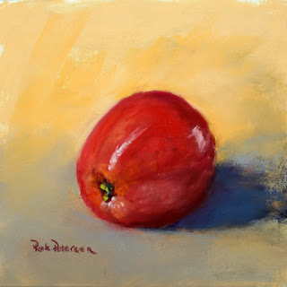
Touch of Green

Pastel, 6x6 on sanded paper

This still life study of big red apple is another painting that began as a timed exercise completed in 3 4-minute segments with a 1 minute wrap-up.  The result was worthy of some finishing touches and a signature.  On the bottom of the fresh apple, the green of the calyx stands out against the red and is the reason for the name.
 

Thursday, February 3, 2022

Apple 1


Pastel 6x6 on Sanded Paper

This still life study of an apple began as a timed exercise completed in 3 4-minute segments with a 1 minute wrap-up.  The result was worthy of some finishing touches and a signature.

Friday, January 28, 2022

Fruit and Twigs


 Pastel 12x12 on UArt

"Fruit and Twigs" pastel on UArt 12x12. Signed and finished. I did this as a an exercise to see what could done to create balance between details and negative space. I connected the details of the fruit and the dominant blank space by inserting the twigs to complete the composition.

Saturday, January 1, 2022

Apple and Vase 1


 Study 6x6 in Pastel on LuxArchival paper

This is the result of my first still life in quite some time.  I have set a goal to improve my painting by regularly doing a still life and doing it quickly.  Here is the process I intend to follow with the result from this first exercise.

1.      Get the proportions and position right, Set the underpaint.

·         Locate your viewpoint in relation to the subject, mark that spot, and always return to that point to look at the subject.

·         Mark the shape of your object(s) first by marking its proportions within the picture frame – top, bottom, right, left.  Mark or sketch significant point within the object to get position and spacing correct.

·         Block in underpaint color / values for object, background, foreground, shadows – reserve white space for highlights.

·         Set block in with denatured alcohol, mineral spirits, or other


2.      Block in the object

·         Set the values and value relationships – darkest darks and lightest lights.

·         Set the broad form with values by color – define the object within the space marked.

·         Set the “accent” color and value relationships.

·         Add color to the whole object and adjust values.


3.      Complete the whole picture

·         Look at the object as a whole and complete the shading, edges, and reflections.

·         Add only the Necessary details.

·         Complete the background and foreground color and value.  Use background and foreground color to define the shape of the object not to be noticed of itself.

·         For this exercise, limit background and foreground objects – stay with abstract shapes or no shapes at all. 


4.      Finish it up

·         Adjust final details and edges.


        Remember, you are an artist not a camera.  Make the image your own.

        I post this message for myself - to keep me from becoming bogged down in detail rather than making my expression of the subject.


Wednesday, January 28, 2015

One Pair, Both Red


Pastel on Wallis, 6x6

I was inspired by these two red pairs.  The natural light from  my studio window added a touch of magic.  I worked with contrasting colors and secondary reflections in the color and foreground.

Saturday, January 10, 2015

Fresh Tangerines


Pastel on gray Canson Mi-Tientes

I was delighted with the color and form of these tangerines I cut from the neighbor's tree just before the prediction of frost.  The background is a playful contrast to the orange of the tangerines.  I did this work to take another look at Canson Mi-Tientes paper using semi-hard pastels.  I cheated with a few touches of Terry Ludwig and Unison in the broad areas of the background, but the fruit and leaves are completely semi-hard pastels.

Photo was updated and name changed from "Before the Frost" on 4/12/15.

Painting is available on Daily Paintworks.

Monday, December 15, 2014

Nursery Violas


Pastel on Wallis, 6x6


Daily painting of yellow violas we purchased for the garden. They are still in the plastic nursery pot.

I changed the background on this small piece a number of times looking for the right balance of tone and temperature.

Tuesday, November 11, 2014

Blue on Yellow


Pastel on Wallis, 9x6

I set this arrangement with blue plumbago flowers. Unfortunately, this painting was done mostly from photographs because the plumbago flowers began to droop almost immediately. I set these flowers in a small, Portuguese pitcher against a light yellow fabric drop.  About 10 last night I went back to look at the painting with the idea of throwing it out.  In a fit of desperation, I picked up the deepest yellow in my box and went to work. That added life by "punching" the yellow in the drop and the lavender in the shadows.

Monday, November 3, 2014

"Amy's Anise"


"Amy's Anise" 9x9 on Wallis

I was inspired by a demo last Saturday by Donna Biggee for the First Coast Pastel Society.  I have not devoted myself to a "daily painting" routine for some time, but here is my effort for today.  It took my some time to get a still life display set up - I'm out of practice.

This little saki vase was just right form some anise blossoms that our neighbor had brought over. I wanted to capture the contrast between the dark orange blossoms on the bright blue of the vase.

Tuesday, April 20, 2010

Another Slice?


Oil on RayMar canvas panel - 6x6


To purchase, contact me.


After a busy week-end and a Monday morning putting out plants and doing yard work, I got back to doing some lemon slices. I have been intrigued by the translucent yellows, oranges, and grays that they present.

Wednesday, April 14, 2010

Primarily Speaking....


Oil of RayMar canvas panel - 6x6

For sale $35.00. To purchase, contact me.

After a few days in a workshop with Carol Marine, I am trying to loosen my approach and strokes in my paintings. I like the way this new effort is progressing.

This panel was done entirely in primary colors (with a little burnt umber).

I selected this arrangement as a challenge to work only with red, yellow, and blue.

Rick Petersen

Friday, January 22, 2010

"Not Enough Room"


Oil on canvas panel - 8 x 8
Completed 1/15/2010

Painting was displayed in JCVA Winter Show (juried) 1/21/2010 - 2/13/2010


To purchase painting, click here.


This is a painting of 5 forelle pears. The pears are quite small and exquisitely colored. I placed them in a small bowl, but not all of them would fit - thus the name of the painting.

This painting required quite a bit of wiping out and starting over. The bowl and shading to the background gave me the most difficulty.

The afternoon light from my studio window shines indirectly on my workspace. The light was ideal for capturing the color of the pears. I used warm yellows and lavender for the background to enhance the subtle shades of cool yellow to light green in the accent areas of the pears.

Rick Petersen

"Galas on Purple"


Oil on canvas panel - 8 x 8

Completed 1/1/2010


This is my first "satisfactory" work as a daily painting.


These gala apples were painted initially with a light beige/lavender background to approximate the original set-up. After the apples were completed, the background was darkened with lavender to accentuate the red and yellow of the apples.


The painting was completed with a minimal pallet of cadmium red medium, cadmium yellow medium, alizarin crimson, permanent green, and white. Dioxin purple and cobalt blue were sued for the background and accents.


I am pleased with the result. Earlier in the afternoon, I almost gave up on this painting - I did not like the lighter background. When I darkened it, I reworked the apples to complete the painting.


Rick Petersen

Morning in the Dunes

Morning in the Dunes Acrylic on canvas panel 8x10 Behind the beach at Talbot Island, the dunes march away one behind the other.  No clear pa...