![]() |
| Abstract 19 |
Thursday, September 15, 2022
Emerging (Abstract 19)
Friday, September 9, 2022
Boundaries
![]() |
| Boundaries |
Gouache and Ink, 4x4 on paper
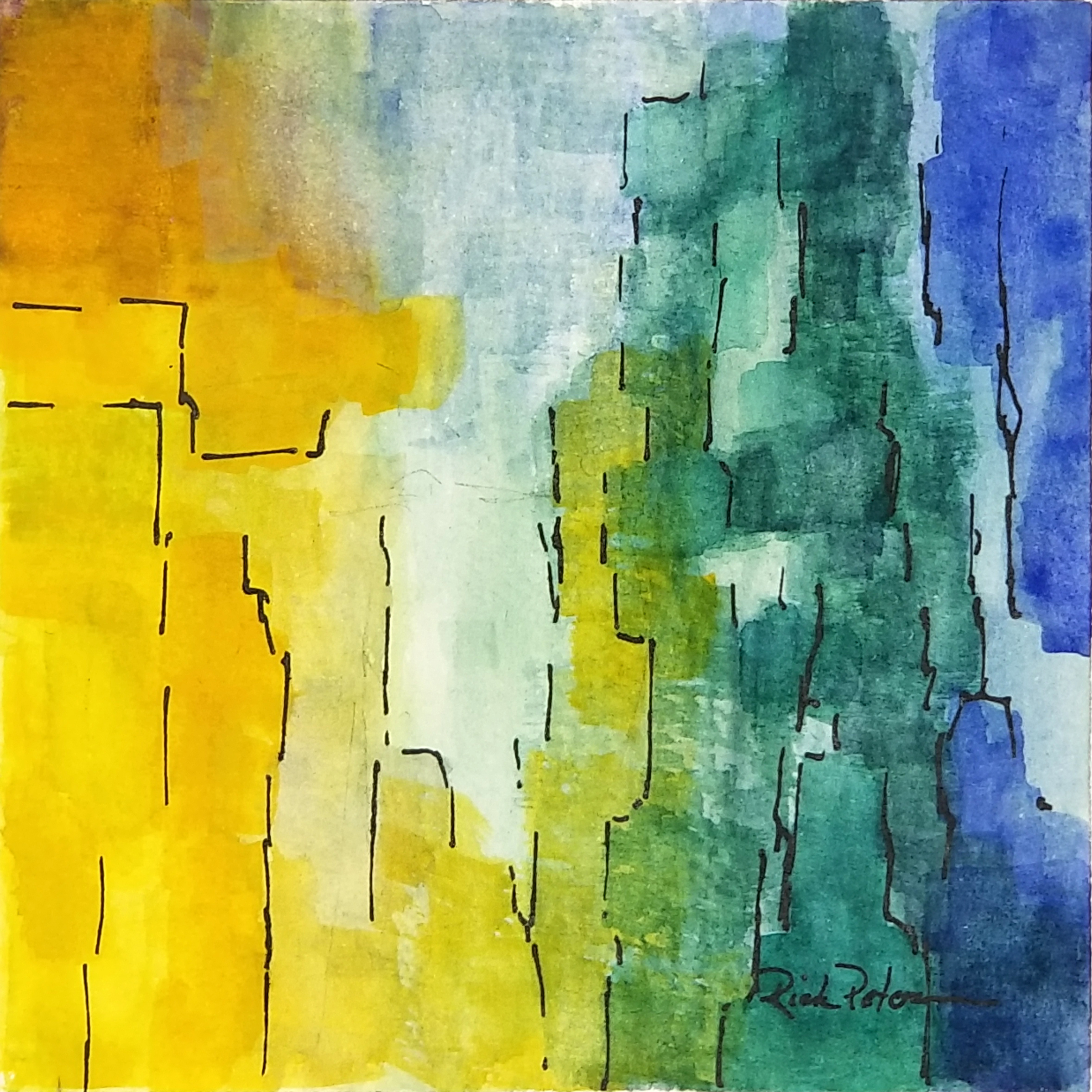
My goal for this painting was to use the warmer side of the color wheel with blue through yellow only. This required that the blue and yellow would not be used where they could blend to green. I wanted the main focal area to be a light area on the lower left with secondary areas in the upper left and upper right. I added the lines to set "boundaries" between close colors and values and to provide suggestions of movement.
Thursday, September 8, 2022
Structures 4
Saturday, September 3, 2022
Quiet Patterns
![]() |
| Quiet Patterns |
This painting developed into the idea of the focal area on the lower left with repeating colors and values leading to the lower right and then to the upper right. With my decision to keep the composition quiet, I chose a palette that eliminated all the red and lavender pigments so the all I am using is azo yellow, Prussian blue, and phthalo green with white.
Thursday, August 18, 2022
Object
![]() |
| Object |
Gouache and Ink, 4x4 on paper
The idea I wanted to explore in this small work was the presence in a completely nonrepresentational painting of one, clearly defined object. Naturally the object would be the center of interest, but I wanted the other features of value, color, and line to create movement and interest within this context.
Tuesday, August 2, 2022
Structures 2
![]() |
| Structures 2 |
Gouache and Ink on paper, 4x4
The concept I wanted to explore in this painting was the evolution of color, form, and line beginning with yellow in the upper left and quinacridone rose in the upper right. I wanted an area in the upper right quadrant to be the focal point and sketched in a few lines to guide the forms. As I added prussian blue and white to the mix and extended the red/lavender, these forms and transitions evolved.
Monday, July 25, 2022
Structures 1
Thursday, July 21, 2022
Patterns 6
Wednesday, July 20, 2022
Structures 1
![]() |
| Structures 1 Acrylic |
Acrylic on Paper, 4x4
My goal in this small "daily" painting was to experiment with Lucas Pasto acrylic to create texture. On top of the texture, I added standard acrylic for color. As the painting developed, colors seemed to fold one into another giving the painting "structure." I added the lines to separate and add distinction to the color areas. The idea was to draw the eye to the upper right where it could rest in the dark red and then to the left to circle the painting.
Saturday, July 16, 2022
Experiments 1
Monday, July 11, 2022
Acrylic Patterns 1
![]() |
| Acrylic Patterns 1 |
Acrylic on paper, 4x4
My focal area was to be the two rectangles in the lower left - one is blue the other a light blue violet. From that I wanted the four quadrants to radiate out with the blue on the left, green on the right. I used the acrylic because it dies quickly and can work to overpaint in areas and to deepen the saturation.
Tuesday, July 5, 2022
Patterns 5
![]() |
| Patterns 22 07 05 |
Gouache 4x4 on Paper
I did this small abstract with a goal of expressing a sense of calm and a feeling of contentment, but I also wanted to create a composition that held a strong focus and encouraged movement and a little tension. I limited my palette to yellow, blue, and purple, with a touch of phthalo green and white. I would like the viewers to create their own story in this painting.
Monday, July 4, 2022
Patterns 4
![]() |
| Curtain Patterns |
Gouache and Ink on Paper, 4x4
My objective in this painting was to build around a focal area in the lower right with two bright pure colors - blue and yellow. I wanted then to build the composition from that with other primaries and combinations. Stroke by stroke the curtain of color evolved, and I added some ink lines to draw the composition together.
Monday, June 27, 2022
Patterns 4
![]() |
| Patterns - 6/27/22 |
Gouache and Ink, 4x4 on paper
In this study, I experimented with using areas of contrast in color and value to create a pleasing composition that brought the attention and interest to my focal area. The format is small enough that I could experiment, and after a number of iterations, I found that amorphous forms with lines worked to create interest and bring focus.
Thursday, June 23, 2022
Patterns 3
![]() |
| Patterns 06 23 2022 |
Gouache, 4x4 on Paper
My initial goal for this painting was to have a focal area in the lower left that as either light lavender or light green with purple and green on the sides coming together at the bottom. I worked on this idea, and though I liked the color, the result was not quite right. My wife suggested I turn it upside down, and it came together. Sometimes it's the simple things that help.
Sunday, June 19, 2022
Patterns 2
Monday, June 13, 2022
Abstract #21
![]() |
| Abstract #21 |
Gouache and Ink, 4x4 on Paper
This is number 21 in a series of 20 because number 19 was a disaster.
My goal in this painting was to create interest and movement with warm colors and contrasting shapes and values. I chose blue to purple for the upper left and light yellow in the lower right blending into warmer orange and red moving upward and to the left. I had to add the touch of green to keep things honest.
Saturday, June 11, 2022
Abstract #20
![]() |
| Abstract #20 |
Gouache and Ink, 4x4 on Paper
This is number 20 in a series of 20 small abstract paintings. My goal in this painting was to dominate the composition with lighter, cooler colors and values. My initial intention was to use the mauve form in the lower left as the focal point, but I darkened it's value in order to make the light yellow green of the center of the composition the primary focal area.
Tuesday, June 7, 2022
Abstract #18
![]() |
| Abstract #18 |
Gouache and Ink, 4x4 on Paper
Number 18 in a series of 20 - My goal when I started this painting was to use light and pure colors of yellow, green, and turquoise in broad, unblended organic shapes. I deliberately avoided straight lines and edges in the borders between colors and in the ink lines. I had planned to use more opaque gouache with white to build up the colors and make contrasts and values more intense, but the original transparent wash was so soft and delicate that I chose to stop here.
Abstract #17
![]() |
| Abstract #17 |
Gouache and Ink, 4x4 on Paper
When I started this series of abstract paintings in gouache, I had initially thrown my first painting aside. After taking another look I added some pen-work to the painting, and it came alive. So I had to renumber my series, and in doing so, I realized that the original #3, this painting, needed the same kind of revision. That allowed me to renumber the "old #3" as the "new #17."
The original concept here was to use blue and its complement orange to create composition around the colors yellow, red, and purple. The later addition of more lines and separation keeps the composition from becoming lost in its own complexity.
Morning in the Dunes
Morning in the Dunes Acrylic on canvas panel 8x10 Behind the beach at Talbot Island, the dunes march away one behind the other. No clear pa...
-
Ballpoint Pen Drawing 8x12 mm. Etude Page Sketch and notes in my sketch book. This drawing is a preliminary study for my demo at...
-
I have completed a 90-day light fast test of NuPastels. I placed the chart in full sun from January 16 through April 15. Note t...
-
Pastel, 9x12 My desire with this painting is to present the colors of autumn in the early morning. In that brief moment as day waits bef...