Tuesday, October 24, 2023

My Tern Yet?

My Tern Yet?

Pastel 12x16 on Wallis Belgian Paper

The tide has gone out, and the waves have left the broad sand to dry a little before they return.  Most of the seagulls and other birds have moved on, but this lone royal tern captured my attention.  He is standing as if waiting for something.  Perhaps he's next and is waiting he tern, or turn.

Monday, October 23, 2023

Refreshing

Refreshing

Pastel on LuxArchival 9x12

Here is the result of a morning's correction of a painting I started a week ago.  From the beginning, it went completely wrong.  I wiped out the whole painting, and started over with a different composition, deferent, palette, and a whole new attitude.  I call that "Refreshing!"

Friday, October 6, 2023

Invitation Window 1

Invitation Window 1

Ink and Watercolor on cotton paper

I have been inspired to do my own renderings of stained glass windows.  I had planned to use them as the foundation for a series of downloadable files for print for greeting cards.  I have received so much encouragement , that I will be offering the framed original paintings through Georgia Nick Gallery (GNG) in St. Augustine. 

Wednesday, October 4, 2023

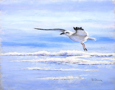
"Coming In"

Coming In

Pastel on self-sanded "gator board"

I have been going through boxes of  paintings that needed something, and I found this one.  I have retouched the color and values, made the image more crisp, and refined the context.  The "new" painting accomplishes all that I wanted to gain originally. I have removed the horizon and any reference to the waves, and I have reduced the foreground to a few streaks of foam. The palette is limited to blue, white, and black with various combinations.  A few touches of lavender, pink and green were added to the foam for structure. Once again, I changed its name - I now catalog it as "Coming In."


Coming Through the Fog 2

Coming Through the Fog 2

Pastel, 9x12 - Rework of an earlier painting.

The original painting was done to examine a "green" landscape by replacing most of the green with purple and blue. The painting had little appeal, and the composition had no true focal area or eye-path. These are my main goals in reworking the painting.

For the rework, I used lighter, more "natural" colors and higher key to suppress details. I used soft edges and larger shapes to draw interest in the treetops in the foreground, and to create paths for the eye to travel through the painting. I wanted to add a little tension with the branches hanging without detailed support, and I repeated that theme in the background to add continuity.

If you are interested in purchasing this painting or would like more information, please see my website:

https://www.rickpetersenartist.com/workszoom/5352205/coming-through-the-fog#

Below is the original painting as it was before I started the rework.


Imagination 2

  Watercolor wash and ink, 6x8 Expressive washes of intense watercolor on wet paper that I permitted to run and blend naturally.  For this p...