Friday, May 29, 2015

Marker Palms

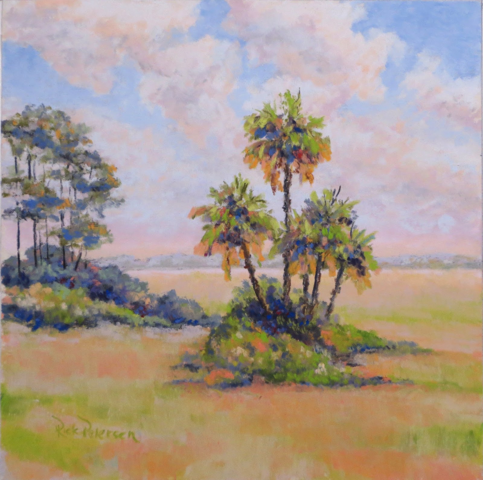
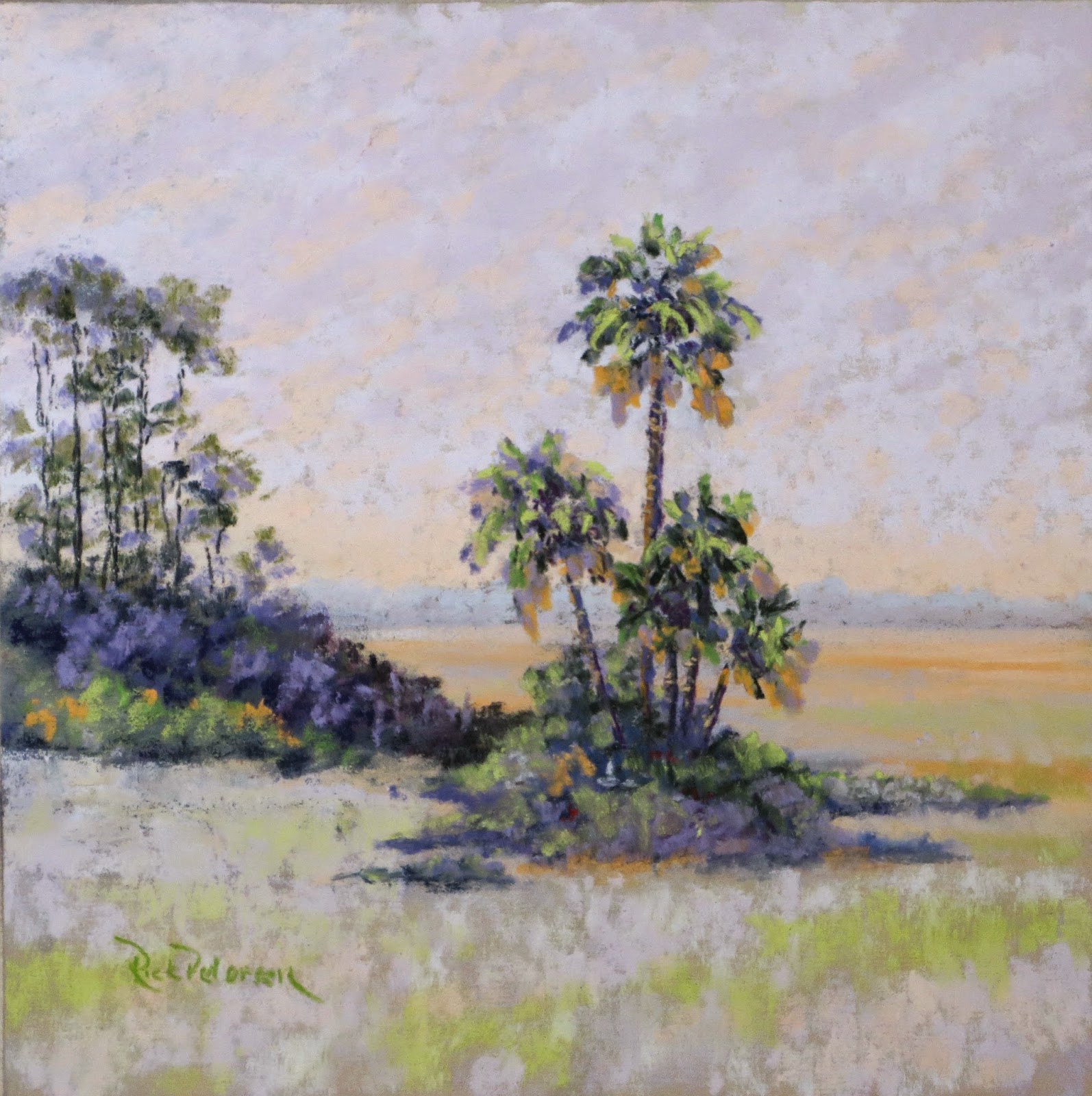
Watercolor, gouache over ink on paper, 7x5

This small work is an view through the dunes to the beach. The path is marked by these two palm trees.  The painting was done with water media over an ink drawing.  I find working that way solidifies my ideas and focuses my vision.

To purchase, click on Daily Paintworks.

Sunday, May 24, 2015

Off-Shore Wind


Pastel on UArt 400 6x9

This painting started as another test of UArt, but when I finished the basics of the main wave, I stepped back to check my progress thinking to add detail in the waves in the foreground and horizon, but I stopped. I was captivated by the contrast to the wave as it is and the almost abstract minimum of detail that remains.
This painting will not be offered for sale - I plan to keep this piece as a reminder to myself of what I can do with fewer details.

Painting can also be seen on Daily Paintworks

Thursday, May 21, 2015

UArt Surface Test

I received notification of the UArt Online Competition, and in order to enter, I needed something done on UArt Sanded Pastel Paper.  I nave a number of different grit grades, but I wanted to understand the comparative properties, so I did a test.  
I set up four (4) 6x9 sheets of paper on a board, and worked a simple still life with the same image on each sheet.  On the top left is 240 grit, top right 320 grit, bottom left 400 grit, and bottom right 600 grit.

I started with a Vine Charcoal Outline.
 

 I usually start with the outline, work and rework it until I'm satisfied, and then take most of it out with a kneaded eraser.  All 4 grits worked well and left a faint outline for the color.

Next I added some color using hard and semi-hard pastels.  I wanted to compare coverage between the papers. 


Next I added softer pastels to see the blending characteristics.


The next step in this test for me was the addition of contrasting colors, purple and blue, and shading to see how it reacted with the different papers.


I then added some contrasts, turquoise and blue, for the background to see how they would react across the different textures.


My reactions and decisions:

1. The 400 and 600 grits work best for me in the style to which I have become accustomed.

2.  In the 400 and 600, edges were easier for me to create and disguise.

3.  Blending of colors is easier and more predictable in the 400 and 600. The coarser grits do not blend in the same way for the effects I try to achieve, but they do take the pastel and hold it well.

4.  Erasing the pastel is more difficult the in the more coarse papers.

5.  All of the papers have a distinct linear texture running across the paper surface.  With more pastel it covers well, but with light touches, the texture is visible.  I do not find this objectionable, but it is something I need to keep in mind as I am working.

I may try to work the 600 grit into a final picture, but the others will go in the box as "experimental."

Monday, May 18, 2015

First Light, Jax Beach


Pastel 6x9


When the eastern sky begins to show color and the light of the coming day rises, the dunes are suffused with color and contrast.  The deep shadows retreat and are replaced with lighter, warmer colors washed across the sand and grasses while the waves and wet sand are painted with the pink and gold of the first light of the dawn.  In this painting, I have tried to catch the glories of this moment when the world moves from deep, cool night to warm, brilliant day.

Saturday, May 16, 2015

Grassy Path, Fatio House

"Grassy Path, Fatio House" pastel 8x8
"Grassy Path," is a depiction of the herb and salad garden against an old coquina wall at the Fatio House, Aviles Street, in St. Augustine.  This garden is behind the buildings.  The path to the wooden gate which passes beneath the dense foliage of a fig tree made a delightful combination and contrast of cool shade against the bright, midday sun.

Monday, May 11, 2015

Morning Palms

"Morning Palms" pastel 8x8
This is another treatment of the painting "Predawn Palms" using warmer, brighter colors.  This painting seeks to capture the feeling of stillness and expectation of the palms and salt marsh as the clouds of the night start to dissipate and the temperature begins to rise.

I reworked this painting on 5/15/15 to change the temp of the foreground and add some color and contrast to the palms.

This painting is available on my Daily Paintworks.

Saturday, May 9, 2015

Romanza on Aviles, 2015

Grape Arbor, Fatio House
To purchase "Grape Arbor, Fatio House" follow the link at Daily Paintworks.

Grassy Path, Fatio House

Both of these plein air paintings were done as part of the Romanza on Aviles, St. Augustine, Florida.  The participating artists drew a location from a "hat," and I drew the gardens at the Ximenez-Fatio House.  This was an ideal place to spend the day painting.

The first painting, "Grape Arbor," caught my attention with the combination of organic forms in the wall, shadow and grape vines which contrasted with the arbor itself and the old stoneware pot and stand.  The bright red of the geraniums was a big plus!

The second painting, "Grassy Path," is a depiction of the herb and salad garden against the old stone wall at behind the buildings.  The path to the wooden gate beneath the dense foliage of a fig tree made a delightful combination of cool shade to escape the bright, midday sun.

Monday, May 4, 2015

Predawn Palms


Pastel 8x8


I have often used this view of the salt marsh with is clump of palm trees and a few craggy pines as the subject for a painting.  In this piece, these elements provide the foundation for an expression in complementary colors.  I couldn't resist throwing the touches of bright green into an otherwise purple and gold composition.

Painting will be available for purchase - click on Daily Paintworks.

Path in the Pines

Pastel 12x16 on LuxArchival 100 This view of an old path through the pine woods has held my attention for years.  The woods are now a housin...